Perspective and Strategy Discussion
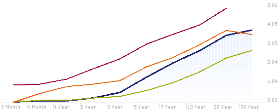
Historical U.S. Treasury Bond Yield Curves
Red Line = November 2003 (New, 30-yr. Treasuries were not being issued at this time)
Orange Line = November 2008
Blue Line = November 2013 (current)
Green Line = November 2012
Over the years, we’ve talked about the concept of the cost of waiting, most recently in 2010. What it means is that you must invest at an ever increasing yield level within the same time limit to equal what you can get if you just invest available funds at today’s rates. This becomes important if the alternative to investing funds today means sitting in a very low or even, zero-percent interest rate money market account or ultra-short bond. This is logical but it bears repeating as it looks like short-term yields are going nowhere fast. Consider the following:
Lehman Brothers filed for bankruptcy on September 15th, 2008 and the financial crisis that followed severely impacted the global economy. This spurred unprecedented actions by the Federal Reserve Bank which included taking the Fed Funds and Discount rates to near zero and also the controversial, Quantitative Easing Programs whereby the Fed has been buying longer-term Treasury and mortgage backed bonds in their attempts to hold down interest rates to coax economic growth. You can see the effects of these actions (orange line) as yields began falling in late 2008. The Fed has been rather successful but market participants have been nudging the longer rates higher over the past few months as the economy has been showing signs of strength—see the Blue Line.
As of this writing, it appears that Janet Yellen will succeed current Fed Chairman, Ben Bernanke. From her own comments we can assume that under her leadership, the Fed will maintain the easy money policy of zero-percent short rates into (or even beyond) 2016. However, it is looking more likely that the Fed will begin the process of tapering, that is, buying fewer longer-term bonds. This would likely result in a very steep yield curve with 1 to 5 year maturities essentially tethered to the zero-percent, Fed Funds rate and longer maturity bonds climbing to “normal”.
If the red line above (representing 2003) indicates where the yield curve should be once rates ultimately normalize, does this mean a spike in yields of 100 basis points or more is imminent? We experienced a rate-shock in May-June of this year on just such taper speculation. While anything is possible, it is doubtful that this will happen as economic activity is not nearly as strong as it was in late 2003. Take a look at a few key comparisons* below:

What we feel will be the most likely scenario is that rates grind slowly upward in fits and starts with each new peak and each new valley ending at a higher point than the previous peak and valley.
If this is the course we can expect, then the logical “sweet-spot” in today’s market falls in the 7 to 12 year range. With these maturities you can expect to receive between 2.15% and 3.20% yield which captures roughly 72% of the yield of 30-year bonds, either Treasuries or AA rated municipals. Interestingly, the taxable, Treasury yields are almost identical to high-grade, tax-free yields using the AA MMD Scale for comparison—see below. When the taxable-equivalent yield is factored, the difference is striking.
 What does all this mean? For investors sitting in cash or investing in short maturities waiting for rates to rise, unless you extend your ladder it is likely that you will be punished for a few more years. For investors with ladders that go longer than 12 years, stick to it, the yield curve and the ladder process is likely to reward you with increasing yields in the next few years.
Sincerely,
Jeffrey D. Irish
Vice President
* Source: Bureau of Labor Statistics & the U.S. Federal Reserve